CMMS Computerized Maintenance Management System Reporting: Dashboards for Leadership Visibility
Explore how CMMS reporting and maintenance dashboards transform raw data from work orders and asset tracking into strategic insights that give leadership clear visibility.
MaintainNow Team
October 13, 2025
Introduction
The meeting request hits the inbox with a thud. *Quarterly Budget Review.* The Facility Director knows what’s coming. They’ll walk into a boardroom, armed with a 30-page spreadsheet exported from the CMMS, and face a CFO who wants to know one thing: “Why do you need a 15% budget increase for HVAC parts and contract labor when production uptime was flat last quarter?”
The director starts clicking through tabs—raw work order data, parts checkout logs, labor hour reports. The numbers are all there, somewhere. But it’s a jumble. It doesn't tell a story. It’s just data. On the other side of the table, the CFO sees a cost center asking for more money without a clear justification tied to business outcomes. The budget request gets trimmed, the team is asked to "do more with less," and the cycle of reactive maintenance continues.
This scenario plays out in organizations every day. It’s the fundamental disconnect between the ground-level reality of maintenance operations and the high-level financial and strategic perspective of leadership. Maintenance teams are buried in the tactical—closing out work orders, chasing down parts, keeping the lights on. Leadership is focused on the strategic—EBITDA, asset depreciation, risk mitigation, and capital planning. The bridge between these two worlds is often a rickety, hand-built structure of exported Excel files and manually created charts. It’s a bridge that frequently collapses under pressure.
For years, the promise of a Computerized Maintenance Management System (CMMS) was simply to get organized—to move away from clipboards and filing cabinets. But the industry has matured. Digitizing work orders and creating a database of assets is now table stakes. The real value, the game-changing potential of modern maintenance management software, lies in its ability to translate the daily grind of maintenance activities into the language of the C-suite. It's about transforming raw data into actionable intelligence. This is the domain of effective CMMS reporting and, more specifically, the intuitive, visual power of leadership dashboards.
The C-Suite Disconnect: When Raw Data Fails to Tell the Story
The problem with most traditional CMMS reporting is that it’s designed by and for maintenance professionals. It speaks our language fluently. It can spit out a list of every PM task completed for Air Handler Unit #7, the mean-time-to-repair (MTTR) for a specific class of pumps, or the total number of reactive calls for the third-floor plumbing.
This is critical operational data. But to a Vice President of Operations or a Chief Financial Officer, it’s noise. They don’t have time to wade through hundreds of line items to connect the dots. They operate on a "so what?" basis. So what if you completed 1,250 PMs last month? What did that *do* for the business? Did it reduce downtime? Did it lower energy costs? Did it defer a multi-million dollar capital replacement?
Without that context, the maintenance department remains a black box—a necessary expense that is difficult to manage and harder to invest in strategically.
The Language Barrier: Translating Wrench Time into ROI
Maintenance teams live in a world of acronyms and metrics that are second nature to them but foreign to the finance department. MTBF (Mean Time Between Failures), PM Compliance, Schedule Compliance, Wrench Time—these are the vital signs of a healthy maintenance operation. But they don't directly map to a profit and loss statement.
A classic report might show a PM compliance rate of 92%. A maintenance manager sees this and knows it’s a solid number, representing a disciplined approach to preventive work. A CFO, however, sees a number without a dollar sign. They see an activity, not an outcome.
A modern dashboard reframes the conversation. It doesn't just show the 92% compliance rate. It visualizes that rate on a trend line next to another line showing a 30% decrease in reactive maintenance calls for the same critical assets. Better yet, it can tie labor and material costs to that unplanned work, showing a tangible cost avoidance of, say, $75,000 for the quarter. Suddenly, 92% PM compliance isn’t just a maintenance metric; it’s a strategic lever for cost control. The language barrier is broken.
The Peril of Lagging Indicators
Most out-of-the-box reports from older CMMS platforms are fundamentally historical. They are excellent at telling leadership what *already happened*.
- Total maintenance spend last month.
- Number of equipment failures last quarter.
- Total overtime hours logged last year.
These are lagging indicators. They are important for historical analysis, but they are reactive. They tell a story of past performance, not future risk or opportunity. Leadership, especially in a competitive environment, is increasingly focused on leading indicators—metrics that can predict future outcomes.
This is where a dynamic dashboard shines. It can surface trends that act as early warnings. For example, a simple chart showing the number of corrective work orders generated from PM inspections. If that number starts to creep up for a specific asset class—like the facility’s fleet of forklifts—it’s a leading indicator. It suggests that despite the PMs, the assets are degrading and may be approaching the end of their useful life. This insight, presented visually on a dashboard, allows a manager to proactively investigate, perhaps by performing more advanced diagnostics or starting the conversation about a capital replacement plan *before* the fleet starts failing during peak season. This is the essence of a proactive maintenance strategy.
Building the Bridge: The Key Dashboards That Resonate with Leadership
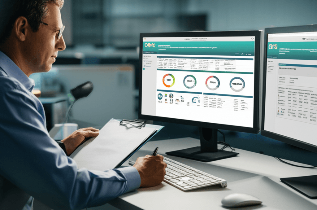
To effectively communicate value and gain strategic alignment, maintenance departments need to present information in a way that leadership can quickly digest and act upon. This means moving beyond data dumps and focusing on curated, visual dashboards tailored to specific business functions. A well-designed CMMS makes this possible, pulling live data from across the operation into a single source of truth.
The Operational Health Dashboard
This is the high-level view for a Plant Manager or Director of Operations. It’s less about individual work orders and more about the overall health and efficiency of the maintenance program.
Key Visuals:
- Planned vs. Unplanned Work Ratio: This is arguably the most important single indicator of a maintenance department's maturity. A simple pie chart or bar graph showing the percentage of labor hours spent on planned, proactive tasks versus reactive, "firefighting" work. A world-class organization often aims for an 80/20 or even 90/10 split. Showing a steady trend moving from, say, 50/50 toward 80/20 is a powerful testament to an effective maintenance management program. It demonstrates control.
- Work Order Backlog Trend: Is the backlog of open work orders growing, shrinking, or stable? A growing backlog is a sign that the team is under-resourced, inefficient, or both. A dashboard can show this trend over time, broken down by priority. A rising backlog of high-priority safety or production-critical work orders is a major red flag that demands immediate attention and resource allocation.
- PM/PdM Compliance: As discussed, this isn't just a number. It's a trend line. A dashboard should show the target compliance rate versus the actual rate over time. When a dip occurs, a manager can drill down to see if it was due to a parts shortage, labor constraints, or access issues, allowing for immediate corrective action.
The Asset Performance & Lifecycle Dashboard
This dashboard speaks directly to the long-term health of the organization's physical assets. It's crucial for capital planning and is where asset tracking evolves into true asset lifecycle management. This view is vital for engineering managers, reliability engineers, and anyone involved in capital expenditure (CapEx) decisions.
Key Visuals:
- Top 10 "Bad Actors" by Cost: A Pareto chart is perfect for this. It instantly shows the 20% of assets that are driving 80% of the maintenance costs. This could be due to labor hours, parts consumption, or contractor costs. When leadership sees that three specific, aging air compressors account for 40% of the entire plant’s reactive maintenance budget, the conversation about replacing them becomes much, much easier. It's no longer an opinion; it's a data-driven business case.
- Total Cost of Ownership (TCO) Tracker: A sophisticated CMMS can track all costs associated with a critical asset—initial purchase price, installation, energy consumption, PM labor, reactive labor, parts, and eventual disposal. A dashboard can visualize this TCO curve over the asset’s life, comparing it to the manufacturer’s expected lifecycle. When the slope of the maintenance cost curve starts to rise sharply, it provides a clear, financial signal that the asset is entering the end-of-life "wear out" phase.
- Downtime Analysis: For any production facility, this is paramount. A dashboard should visualize downtime, not just as a total number of hours, but broken down by asset, production line, and root cause (e.g., mechanical failure, electrical failure, operator error). This allows the team to focus reliability efforts where they will have the greatest impact on the bottom line.
Platforms designed for modern maintenance, like MaintainNow, are built on the principle that this data should be easy to capture. By enabling technicians to log parts, labor, and failure codes directly on a mobile device at the point of work using their app (`app.maintainnow.app`), the system automatically builds the rich data history needed to power these insightful asset lifecycle dashboards. The administrative burden of data entry is removed, and the quality of the data skyrockets.
The Financial & Compliance Dashboard
This is the view for the CFO, the risk manager, and the executive team. It strips away the technical jargon and presents maintenance performance in the language they understand best: dollars and risk.
Key Visuals:
- Maintenance Budget vs. Actual Spend: A real-time gauge or burn-down chart is essential. It should show the overall MRO budget for the year, the actual spend to date, and a forecast for the remainder of the year. It needs to be drillable, allowing a user to see the breakdown by cost center (e.g., HVAC, Electrical, Plumbing) or expense type (e.g., Internal Labor, Parts, Contractors). This level of transparency builds trust and demonstrates fiscal responsibility.
- MRO Inventory Value & Turns: How much cash is tied up in the stockroom? A dashboard can visualize the total value of MRO inventory. More importantly, it can track inventory turns. A low turn rate suggests overstocking and obsolete parts ("ghost assets"), while a high turn rate with frequent stockouts points to poor planning. Optimizing this is a direct contribution to the company's working capital.
- Safety & Regulatory Compliance Status: For industries with heavy oversight (e.g., manufacturing, pharmaceuticals, food and beverage), this is non-negotiable. A dashboard can provide an at-a-glance view of compliance with critical safety inspections, environmental checks (like EPA-mandated leak inspections), and OSHA-related PMs. It can show upcoming deadlines and flag any overdue tasks, providing a documented audit trail and demonstrating a commitment to mitigating operational risk.
The Technology Enabler: How Modern CMMS Delivers True Visibility
It's one thing to know what metrics to track; it's another to have the technology to do it efficiently and accurately. Legacy CMMS systems, often clunky, on-premise solutions, made this kind of reporting a chore. It required specialized IT knowledge, manual data exports, and hours of manipulation in other software. The result was a static report that was already out of date the moment it was printed.
Modern, cloud-based CMMS platforms have completely changed the game. They are designed from the ground up to be data aggregation and visualization engines, not just digital filing cabinets.
Real-Time Data, Not Rear-View Mirrors
The single biggest shift is the move to real-time data. This is almost entirely driven by the adoption of mobile CMMS technology. When a technician receives, works on, and closes a work order on their smartphone or tablet in the field, that information is instantly updated in the central system.
There is no more lag time waiting for paper work orders to be returned to the office and manually entered. There are no more questions about the status of a critical job. A manager can see the work progress in real time.
This immediacy feeds directly into the dashboards. A production-critical machine goes down, and a work order is created. The Plant Manager sees the OEE dashboard for that line turn from green to red instantly. They can see that a technician has been assigned and is en route. This level of situational awareness was impossible just a decade ago. It allows for faster, more informed decision-making at every level of the organization.
Configurability: The Right View for the Right Role
The idea that a single dashboard could serve everyone from a maintenance lead to the CEO is flawed. Their needs, priorities, and vocabularies are completely different. A modern CMMS acknowledges this by providing highly configurable, role-based dashboards.
The Maintenance Supervisor’s dashboard might be dominated by a technician schedule, a map of open work orders, and a list of PMs due this week. It’s tactical and immediate. The Facility Director's dashboard will feature the higher-level metrics we've discussed—the planned vs. unplanned ratio, budget tracking, and asset "bad actor" charts. The VP of Operations might have an even more abstracted view, rolling up OEE and maintenance cost data from multiple sites into a single enterprise-level dashboard.
This ability to tailor the view ensures that users get the information they need without being distracted by irrelevant data. Systems like MaintainNow have made this level of configurability standard, moving away from the rigid, one-size-fits-all reports of legacy software. It empowers users to build their own "mission control" center, focused on the key performance indicators that matter most to their role.
The Foundation for Predictive Maintenance
While a well-executed preventive maintenance program is the cornerstone of reliability, the industry is constantly pushing toward a more predictive model. Predictive Maintenance (PdM) involves using sensor data (vibration, thermal, oil analysis, etc.) and other techniques to predict a failure *before* it occurs.
The CMMS dashboard is the window into this future. As organizations deploy IoT sensors on their most critical equipment, the data streams they generate can be fed into the CMMS. The dashboard then becomes the visualization layer for this predictive intelligence. Instead of just seeing that a PM was completed on a motor, a manager can see a trend line of its vibration signature slowly creeping toward an alarm threshold.
This allows for a shift from time-based maintenance (e.g., "overhaul this pump every 2,000 hours") to condition-based maintenance ("overhaul this pump when its vibration analysis indicates bearing wear"). This is the pinnacle of an efficient maintenance strategy, ensuring that resources are expended only when necessary, maximizing asset life and minimizing intrusive maintenance. The dashboard is what makes this complex data understandable and actionable for the maintenance team.
Conclusion
The evolution of CMMS reporting from static, text-heavy data dumps to dynamic, visual, and role-based dashboards represents a profound shift in the role of the maintenance department. It’s a move away from the perception of being a reactive, unavoidable cost center toward a new identity as a proactive, data-driven strategic partner.
When a Facility Director can walk into that quarterly budget review and, instead of a spreadsheet, pull up a live dashboard on the screen—a dashboard that clearly links PM compliance to reduced downtime, that shows the TCO of aging assets justifying a replacement plan, and that demonstrates a clear, positive trend in the planned vs. unplanned work ratio—the entire conversation changes.
The discussion moves from defending costs to investing in reliability. It moves from justifying headcount to enabling a strategy. This visibility doesn't just make the maintenance department look good; it provides the entire organization with a clearer understanding of operational risk, asset health, and opportunities for improvement. The right reporting tools don’t just report the news; they provide the intelligence needed to make better news in the future. They transform the endless stream of data from work orders and asset tracking into a compelling story of value, a story that finally gets the attention and resources it deserves.
Ready to implement these maintenance strategies?
See how MaintainNow CMMS can help you achieve these results and transform your maintenance operations.
Download the Mobile App:

✅ No credit card required • ✅ 30-day money-back guarantee • ✅ Setup in under 24 hours